Transforming Federal Bank's Mobile Experience
OVERVIEW
A customer opened FedMobile to pay a piped gas bill. She scrolled modules, tapped into two wrong sections, backed out twice. The feature existed, buried two levels deep. This was not an edge case. Across 10M+ monthly active users, 67% of services sat below 5% engagement. 7% of support tickets were people asking how to find features that already existed. For a bank serving India's mobile-first audience, this discovery failure was costing both trust and revenue.
I led the home screen redesign over 6 months as the sole product designer with a 12-person cross-functional team. The approach: restructure the IA around user intent, remove redundancy, and introduce a modular layout that could grow with the bank's product roadmap.
GOALS
- Reduce task friction: Help users find and complete their most common banking tasks in fewer steps, with minimal cognitive load.
- Build a scalable IA: Design a modular structure that supports the bank's monthly feature additions without degrading the home experience.
- Close the discovery gap: Surface underused revenue-driving services and promote usage of features users simply couldn't find.
SOLUTION
I started with a full UX audit, mapping every module and interaction path to understand why the home experience had become so fragmented. The root issue was not too many features. It was that years of incremental additions had created overlapping entry points and inconsistent patterns. I consolidated overlapping features, restructured the IA around user intent, and introduced a modular card-based layout the business could configure without shipping UI changes.
MY ROLE & APPROACH
I owned research, IA, interaction design, prototyping, and design system updates end-to-end. I collaborated daily with 2 PMs, a data analyst, and 6 engineers, and presented to the head of digital banking bi-weekly. Key decisions around IA restructuring, the move to user-configured Quick Links, and search-first navigation were mine to make and defend.
OUTCOME
27% adoption of search
MAU-based repeat usage up 16%
19% increase in engagement with revenue-focused modules on the home screen.
From problem framing to final pixels: here's how I got there.
The challenge
Over several years, FedMobile's home screen had become a patchwork of feature additions driven by different teams and business priorities. Each module made sense in isolation, but together they created a cluttered, inconsistent experience. Users struggled to find what they needed, even when the app technically offered it. The numbers told a stark story: 67% of services received less than 5% engagement, and 7% of support requests were users asking how to find features that already existed. This wasn't a visual design problem. It was a structural one, deeply rooted in how the app's information architecture had evolved without a unifying framework.
Increase discovery and usage of revenue-focused modules.
Help customers quickly find what they need with clear, consistent patterns and accessible UI.
Team Alignment Sessions
I facilitated alignment sessions with Product, Engineering, QA, and business stakeholders. The first question I pushed the team to answer: are we patching the current home screen, or redesigning it from the foundation? By mapping past product decisions alongside support data, I helped the team see that quick fixes would not address the structural issues. These sessions aligned everyone on a full overhaul and gave me the constraints I needed.
Key services were buried, hurting engagement and revenue.
Layout patterns, icon styles, and interaction behaviours varied across modules, making the app feel unpredictable and eroding user trust.
Monthly module additions were outgrowing the current layout.
Gathering insights
I structured research around three lenses: what the data revealed (6 months of CleverTap analytics across 10M+ MAU), what users experienced (48 structured interviews, 65 session recordings reviewed with PM support), and what the market was doing (25 apps benchmarked across 12 Indian banks, 2 international banks, and 11 fintech apps). Each lens pointed to the same conclusion: the IA had outgrown its structure.
DATA & ANALYTICS
I analyzed 6 months of CleverTap data across the full user base, reviewing heatmaps, session recordings, and funnel drop-offs for the top 15 user flows. The picture was stark: users logged in frequently but engaged with only a small fraction of the app. Behaviour flows revealed strong navigation friction and low discovery across key revenue-driving services.
Most users relied on just a few modules, while the majority of banking and lifestyle services went unnoticed.
Backtracking and early exits indicated users were missing important modules and facing friction in deeper navigation.
User Research
I conducted 48 structured interviews (including 26 I led directly) and reviewed 10 key session recordings to understand why users struggled despite the app offering dozens of services. People weren't avoiding features intentionally, they simply didn't know those features existed. One participant told me: "I've used this app for 2 years and had no idea I could pay piped gas bill here." These insights validated the behavioural patterns I saw in the analytics.
Users often scrolled aimlessly or repeated the same taps because they couldn’t locate deeper modules.
Many participants were surprised to learn FedMobile offered lifestyle tools, bill payments, and non-banking investment options, services they had never encountered despite months of regular app usage.
Competitive Analysis
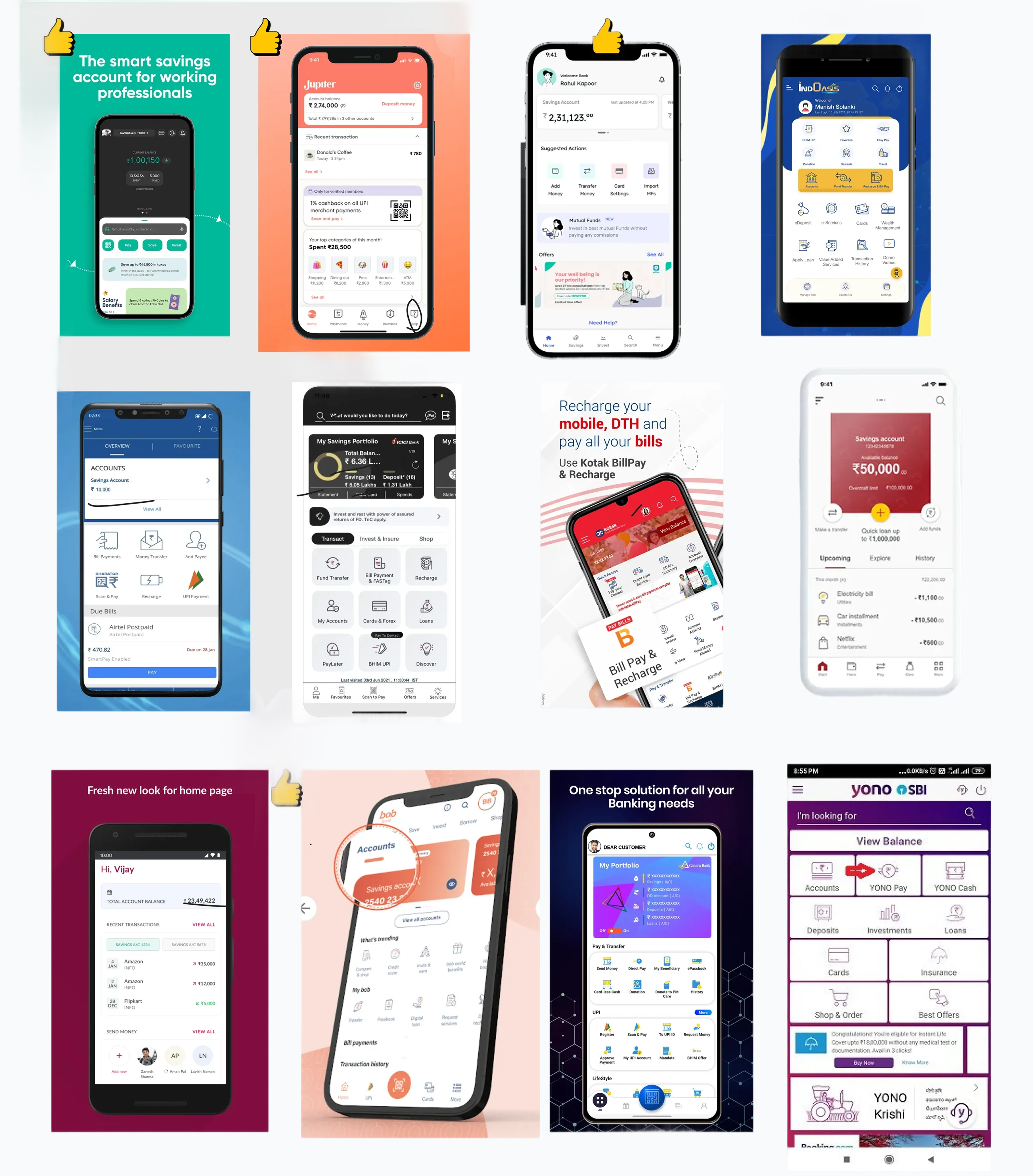
To understand where FedMobile stood in the market, we reviewed 12 Indian banks, 2 international banks, and 11 fintech apps. Traditional banks struggled with feature-heavy layouts just like FedMobile, while fintechs excelled at clarity, hierarchy, and surfacing relevant actions quickly.
Most banking apps faced similar issues with dense menus, hidden modules, and unclear information hierarchy.
Fintech apps showed how simplified IA, cleaner layouts, and prioritized actions could drastically improve discoverability.
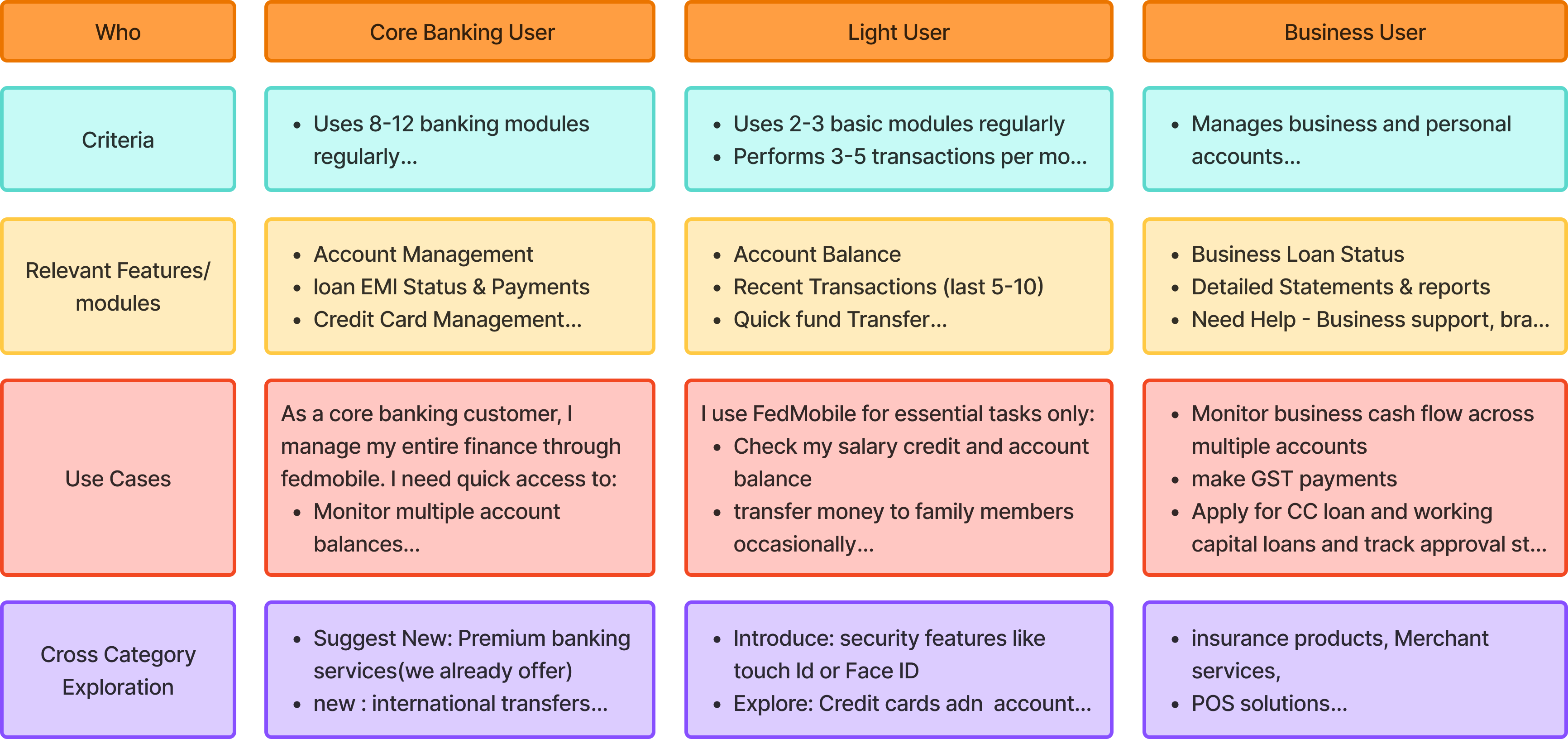
Personas
From interviews and behavioural data, we identified three user groups shaped by digital literacy, confidence, and banking needs. These personas guided how much complexity to surface and how predictable each interaction needed to be on the home screen.
Personas ranged from highly digital-savvy users to traditional customers needing simpler, clearer paths.
Each persona's goals influenced which modules needed prominence, which patterns had to be consistent, and which tasks required the least friction.
Before redesigning the home experience, we needed to unpack past product decisions and evaluate the design and technical constraints shaping what was realistically possible.
Earlier choices, like surfacing credit cards, banner-driven promotions, and burying key modules, created an inconsistent home layout and hid essential services.
The redesign had to work within the existing but improved design system, meet accessibility needs, and support multiple user types while remaining visually consistent.
Legacy architecture limited navigation changes and required search, module ordering, and new components to fit within existing performance and SDK constraints.
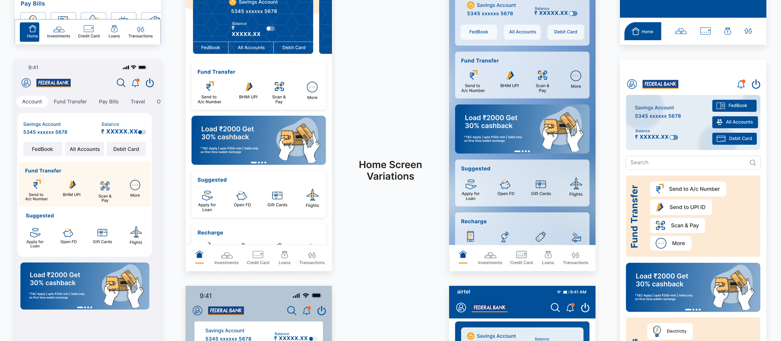
Exploring Directions
With the problem space mapped, I moved into rapid exploration. I sketched layout directions, module groupings, and interaction patterns. Through mid-fidelity variants and cross-functional reviews, I stress-tested each direction against three criteria: does it improve discoverability, can it scale as modules are added, and is it technically feasible within the existing SDK?
Exploring layouts, grouping logic, and module hierarchy to improve discoverability.
Expanding icons, card styles, and patterns to support future modules and user segments.
Exploring ways for business teams to dynamically surface high-value modules.
Defining unified patterns for CTAs, navigation, and interaction behaviours.
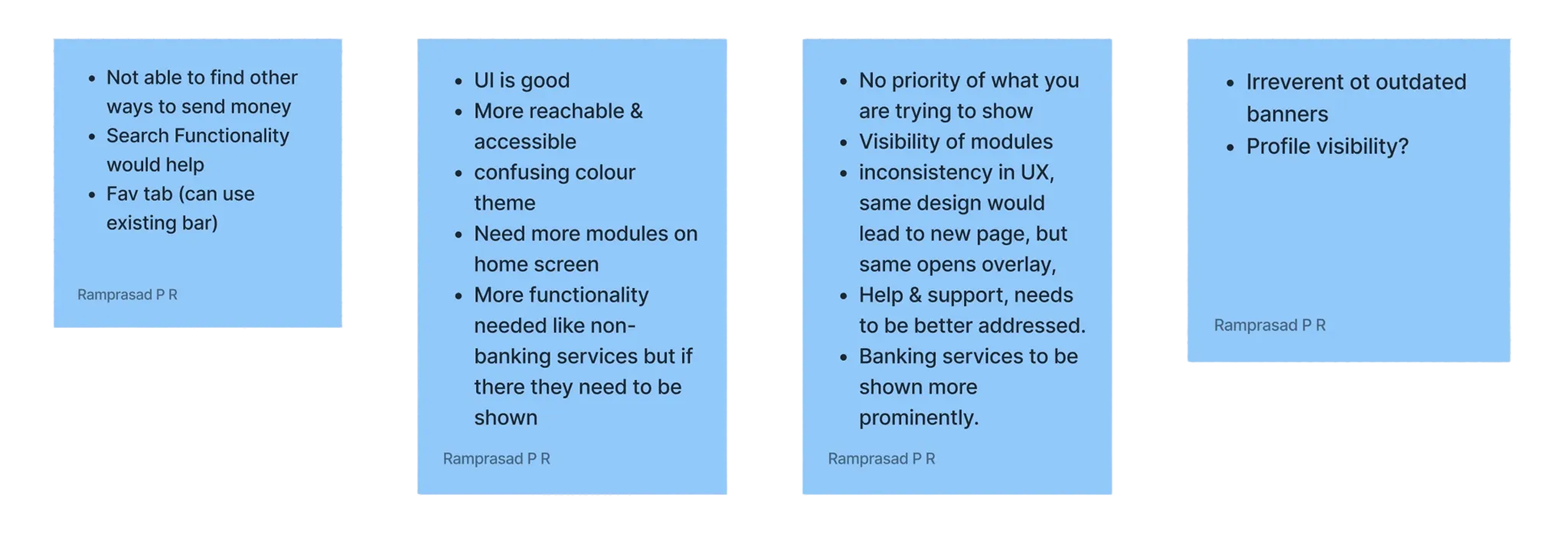
Validating Concepts
I ran moderated usability sessions with 12 participants across three user segments to validate whether the restructured home screen improved task completion and feature discovery. Testing focused on search adoption, Quick Link configuration, and module navigation depth.
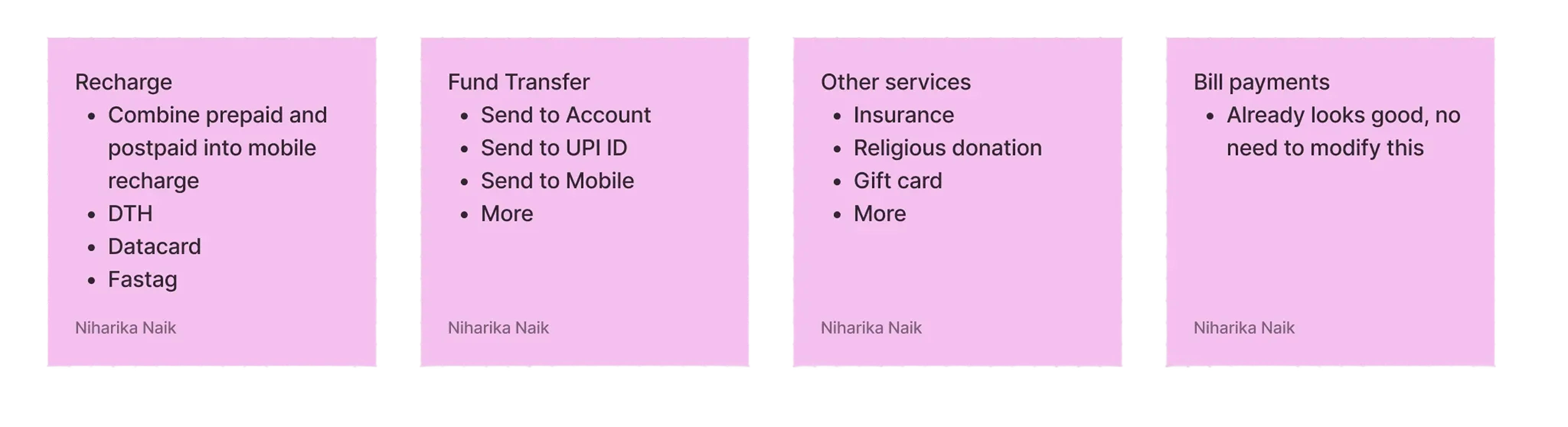
Module Prioritization
Testing helped us confirm whether the data-driven module order aligned with user expectations and common task paths. These sessions validated which features needed prominence and surfaced moments where ordering required refinement.
Users naturally gravitated toward frequently used services, reinforcing the need for priority-based placement.
A reorganized layout shortened task paths and reduced backtracking across deeper modules.
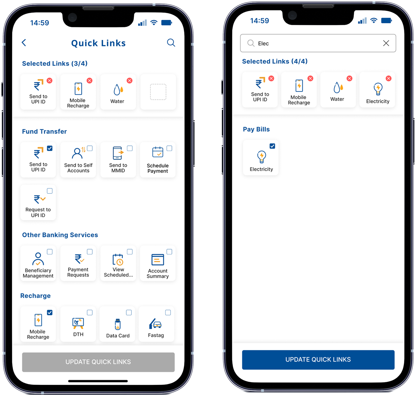
Quick Links
I started with system-generated MRUs for home screen shortcuts. After research, it was clear people wanted control, not automation. I updated MRUs to user-configured Quick Links, giving users agency and predictability. Trade-off: higher setup friction, but significantly higher satisfaction and repeat usage.
Giving users the ability to select and reorder shortcuts felt more intuitive than system-generated suggestions.
Clear selection patterns and simple reordering made Quick Links easy to configure across user types.
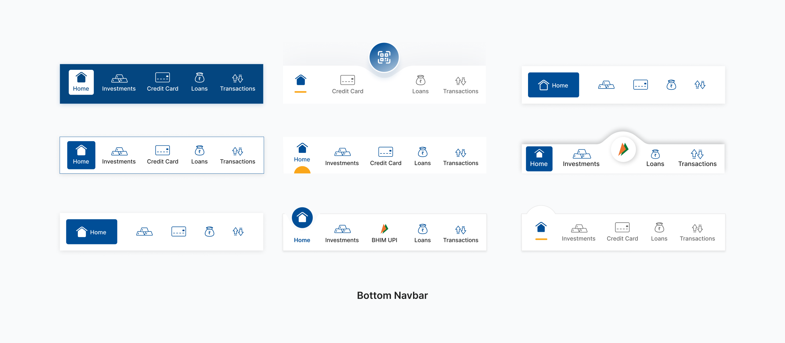
Interaction Behaviour
Testing exposed micro-friction points around inconsistent CTAs, icon clarity, and entry points. These insights guided refinements that made interactions more predictable and trustworthy throughout the home experience.
Users expected identical actions to behave the same way, prompting us to unify interaction patterns.
Ambiguous icons were updated to improve clarity, reinforce affordance, and reduce hesitation.
Accessibility
Testing highlighted the need for better visual clarity, predictable interactions, and comfortable touch targets, especially for users with varying digital literacy levels. These insights influenced updates to contrast, sizing, and cognitive load across components.
Larger tap areas reduced errors and made key actions easier to perform on smaller screens.
Enhanced contrast, clearer icons, and simpler layouts helped users navigate with greater confidence.
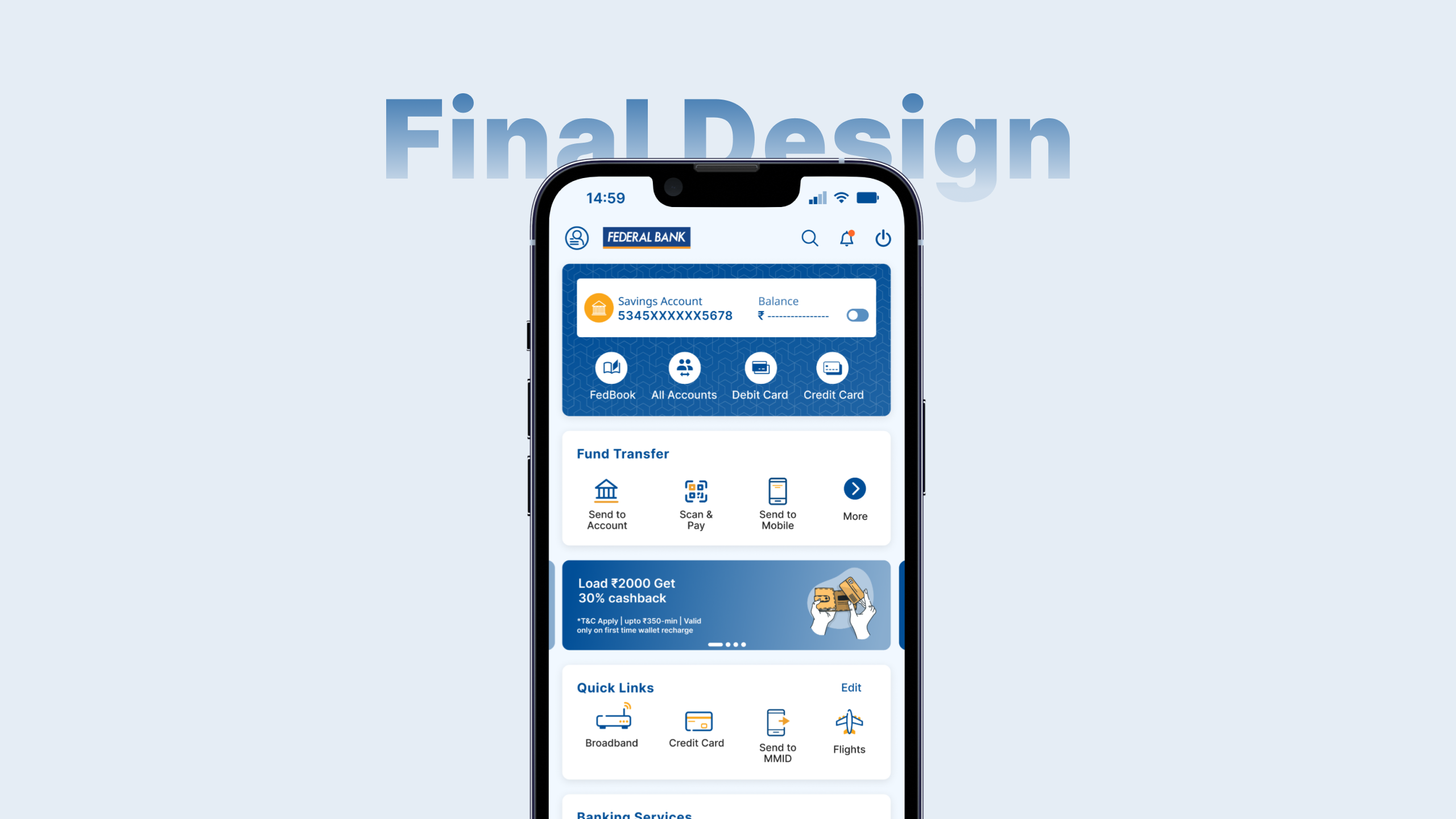
Bringing It All Together
The final design distills research, testing, and technical constraints into a home experience built around three principles: instant access through search, structured discovery through prioritized modules, and personal control through customizable Quick Links.
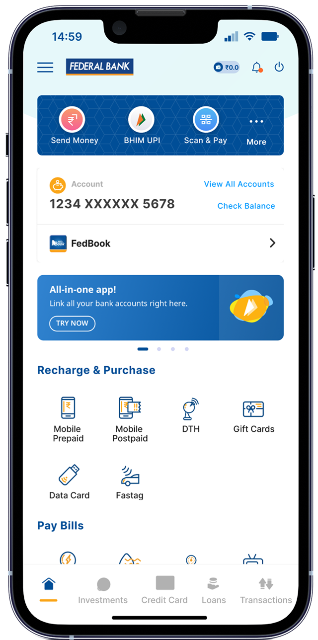
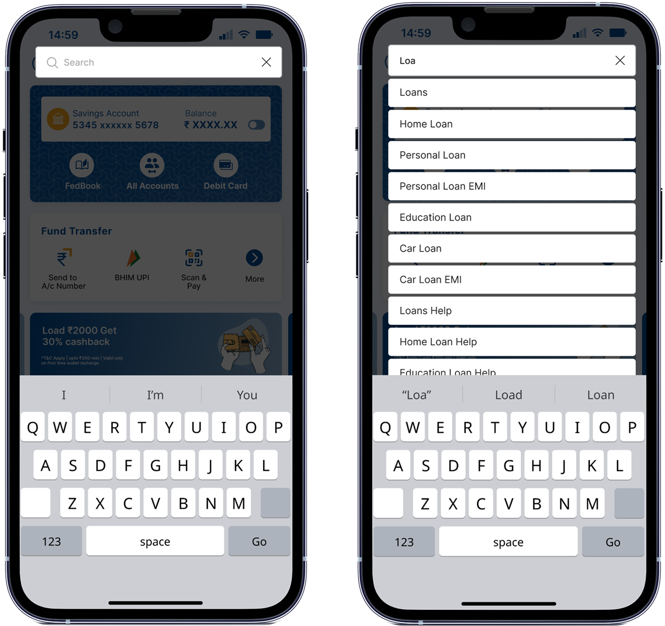
Search Integration
The redesigned search creates a universal entry point for users who previously had to scroll, guess, or backtrack to find key modules. Placing search in the top bar makes it instantly discoverable and reduces the effort required to access deeper banking features.
The top navigation placement makes search visible and predictable for all user types.
Results surface modules, categories, and sub-categories in one unified view.
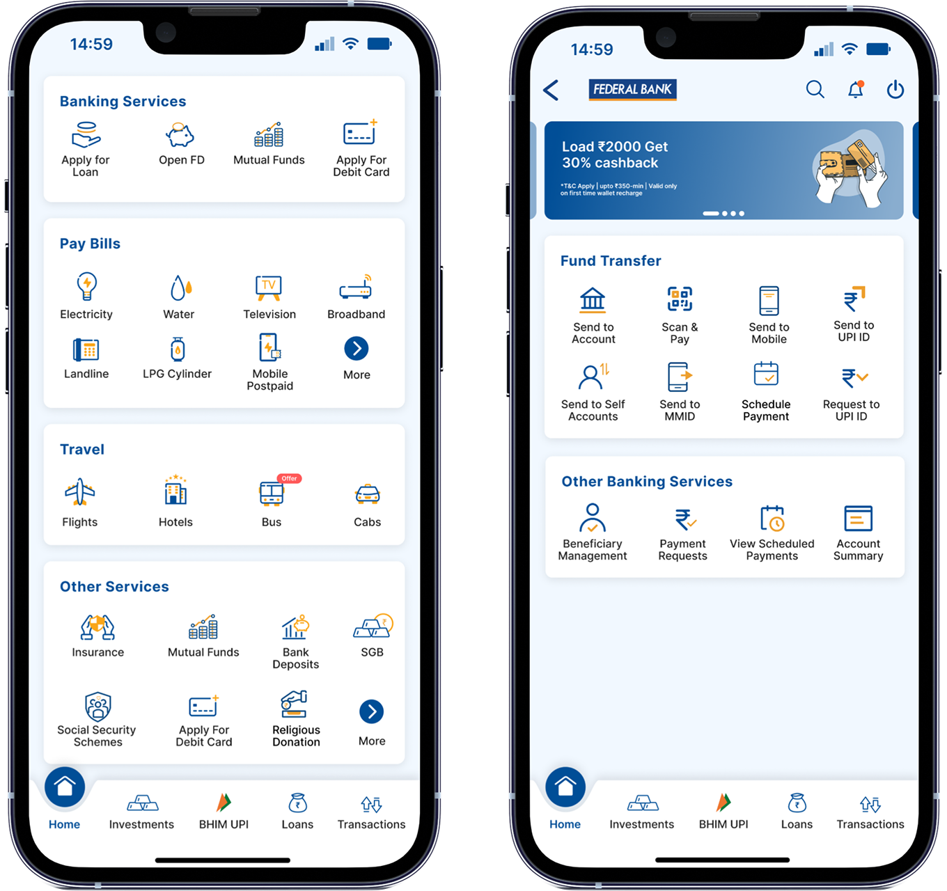
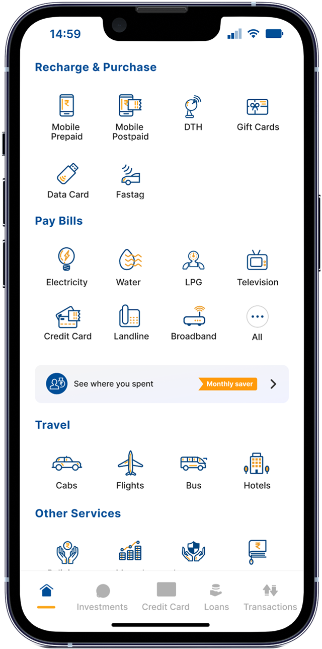
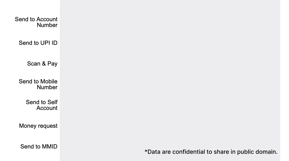
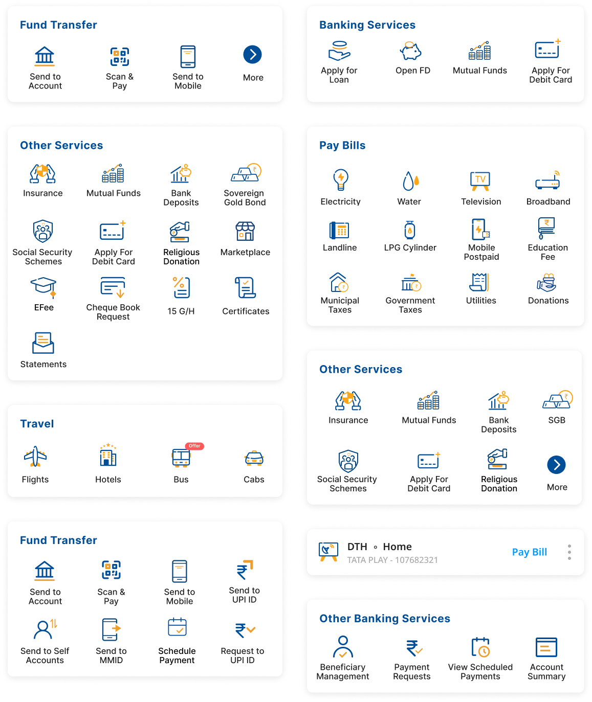
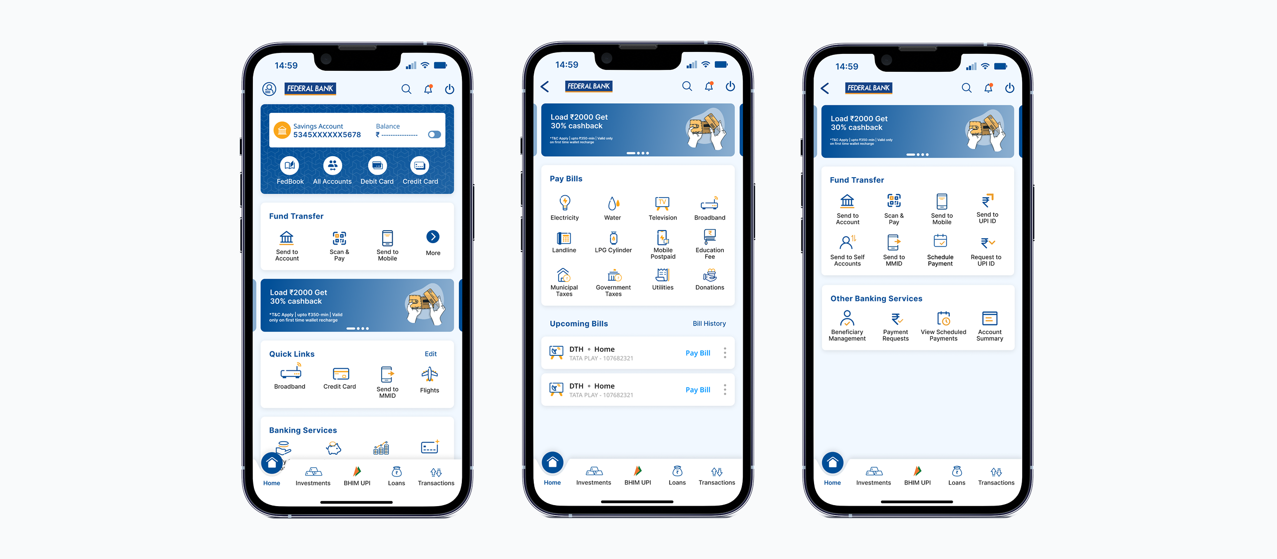
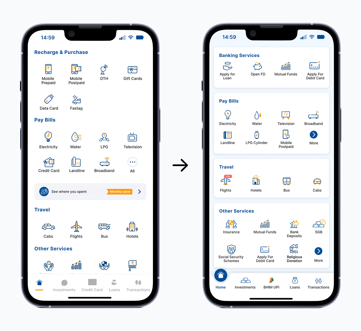
Banking Services Card
A dedicated card now highlights essential banking products that were previously hidden under parent categories. This layout helps users quickly access revenue-generating services while giving the bank flexibility to promote priority modules.
Key services appear upfront, improving engagement and task completion.
Business teams can promote modules dynamically without UI changes.
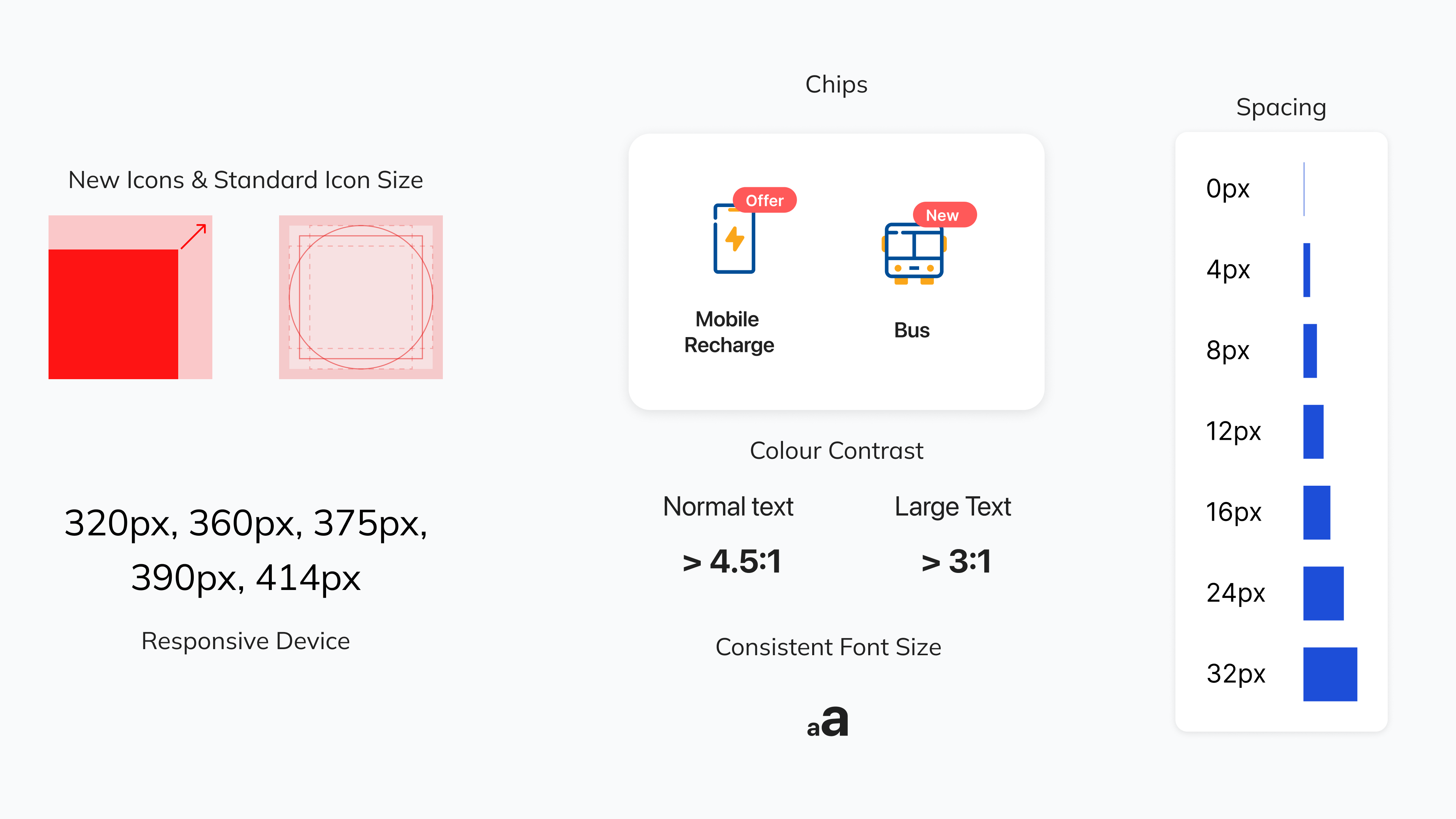
Updated Icon System
The new icon set improves clarity across modules with consistent shapes, weights, and visual meaning. This refresh supports better scannability and aligns the interface with a more modern, cohesive style.
Icons share a unified visual language for faster comprehension.
Clearer metaphors reduce hesitation and improve user confidence.
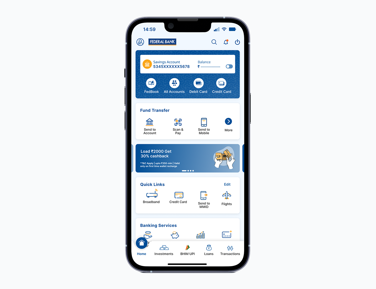
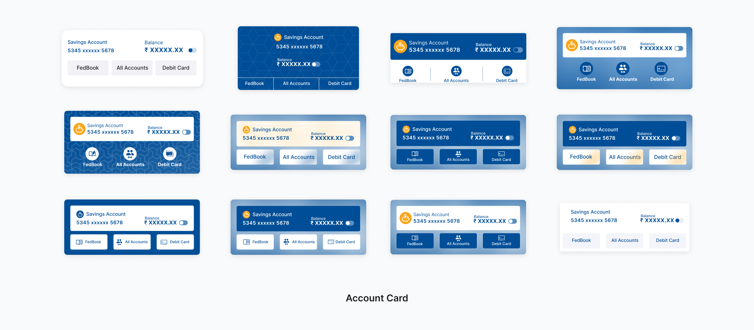
Enhanced Account Card
The account card was restructured for clarity, consistency, and direct access to frequently used actions like debit and credit card management. Updated icons and predictable CTAs make the card more informative and easier to navigate.
Unified actions eliminate confusion between similar-looking buttons.
Debit and credit card entry points are now placed where users expect them.
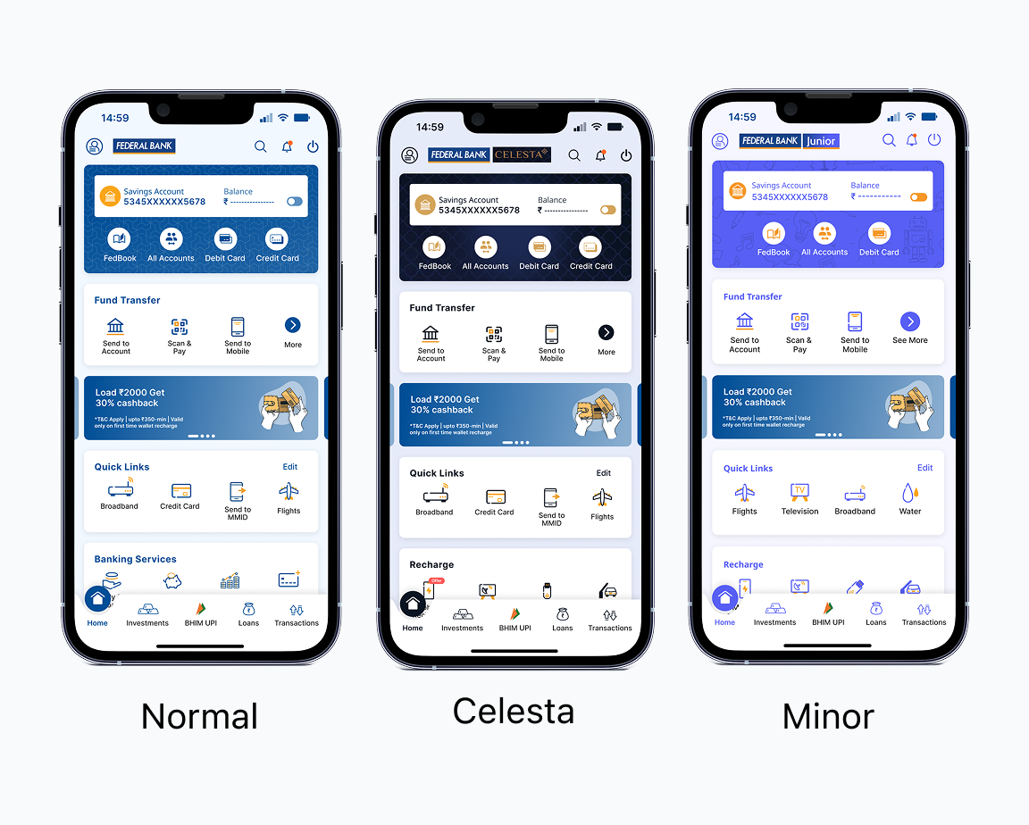
User Type Adaptations
FedMobile serves Regular, Minor, and Celesta users, each with different visual themes and priorities. The redesigned structure adapts to each segment while maintaining a consistent core experience.
Color palettes and accents adjust per user segment without altering layout.
A shared structure ensures predictability regardless of account type.
The Results
The redesign improved discoverability, increased engagement with revenue-driving services, and made everyday tasks faster for millions of users.
Increase in Repeat Users (MAU)
Increase in Search Usage
Revenue Module Engagement
Reduction in Task Abandonment
Customer Feedback
WHAT DIDN'T WORK
The first version of search surfaced too many results without clear categorization. Users found it faster to scroll than to parse an unstructured list. I redesigned search results to group by category (Payments, Services, Settings), which drove the 27% adoption increase.
The initial Quick Links onboarding was also too passive, users didn't realize they could customize shortcuts. I added a first-time guided setup flow that prompted users to select their top 4 modules, which increased Quick Links adoption to 26% of home screen users in the first month.
Learning from Project
This project changed how I approach design at scale. Three principles I carry into every project:
If the interface works for a first-time smartphone user in rural India, it works for everyone. Designing for the least digitally literate user forced clarity that benefited all 10M+ users.
Analytics told me 67% of services were unused. Interviews revealed that users didn't know those services existed. Neither data source alone would have led to the right solution. I needed both to frame the problem correctly.
The most impactful decision was not a design choice. It was convincing stakeholders to do a full overhaul instead of patching the existing home screen. That alignment session saved months of wasted incremental effort and gave me the constraints I needed to design boldly.
GitHub Plugin for Secrets detection
Designed a GitHub-native security plugin from research through shipped product. Inline secret detection, guided remediation, and team dashboards that reduced unresolved secrets without disrupting developer flow.